Hi Keerthana,
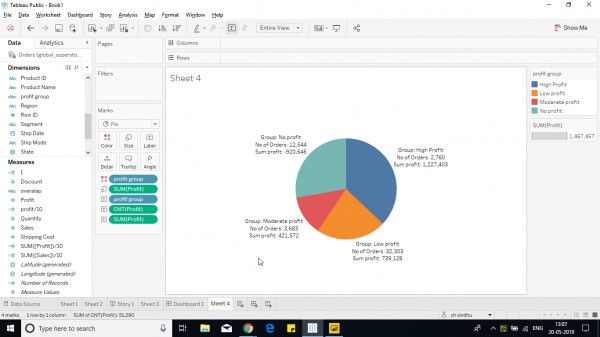
As you have already created a calculated field with groups, its easy to form a pie chart, follow the below steps:
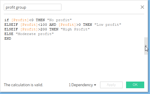
For ex: This is my calculative field that i'm using to show a pie chart.
IF [Profit]<0 THEN "No profit"
ELSEIF [Profit]<100 AND [Profit]>0 THEN "Low profit"
ELSEIF [Profit]>200 THEN "High Profit"
ELSE "Moderate profit"
END

Select the marks shelf from automatic to pie.
Drop the field created in color shelf and the aggregation of measure in size shelf.

Hope it helps.
Learn How To Visualize Multiple Measures Using Pie Chart In Tableau?
 REGISTER FOR FREE WEBINAR
X
 Thank you for registering
Join Edureka Meetup community for 100+ Free Webinars each month
JOIN MEETUP GROUP