Hi Nithin,
Pie chart is used to show comparison of single vs total entity. Pie chart is best to denote at the highest composite form of a field. As the measures increases, the chart becomes unclear to understand.
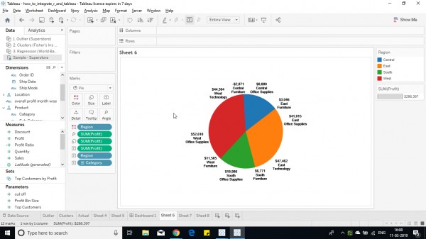
1. Select the measure/dimension you want to plot the chart. Click on show me and select the pie chart.

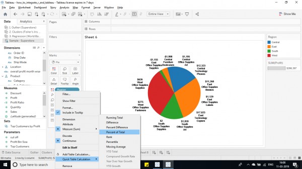
2. Right click on the field and click on quick table calculation and select percent of total.

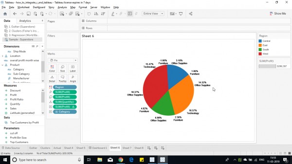
3. After applying quick calculation on field.

Hope this helps you.
For an in-depth explanation check out Tableau Training Course details.
 REGISTER FOR FREE WEBINAR
X
 Thank you for registering
Join Edureka Meetup community for 100+ Free Webinars each month
JOIN MEETUP GROUP