Tableau-donut chart with partitions

0 votes
How to show a part of total instead of all partitions in donut chart? Can someone help me?
Mar 29, 2019 in Tableau by Sindhu
1,568 views

1 answer to this question.

0 votes

Hi Sindhu,

Follow these steps to create different partitions for each donut chart:

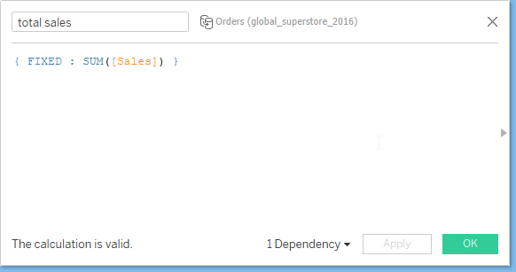
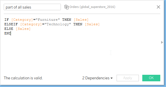
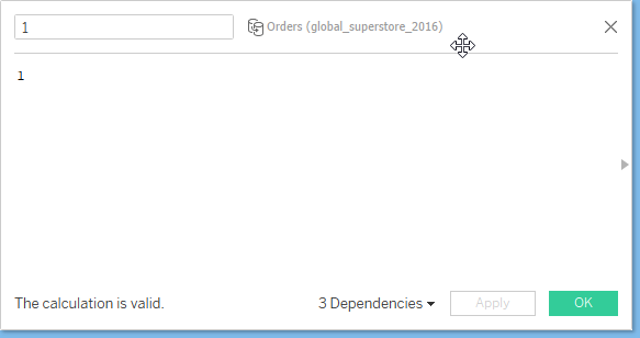
1. Now Create 2 calculated fields like this.
2. Select the measure and aggregation of that measure to show the donut chart.
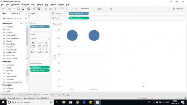
3. Drag the measure names from column shelf to color shelf and measure values from row shelf to angle shelf.
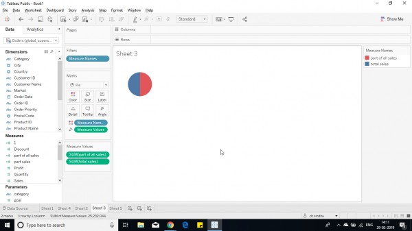
4. Now drag and drop the field in the row shelf.(make it attribute not sum(1) ) and add category(partition field) in the column shelf.
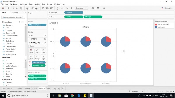
5. Now remove all measures from any shelves for 2nd row.

6. Now make dual axis in row shelf.
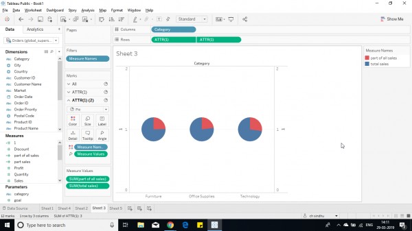
7. Now change the size in ATTR(1)(2) lower than before.

8. Change the color ATTR(1) (2) to white from color shelf.
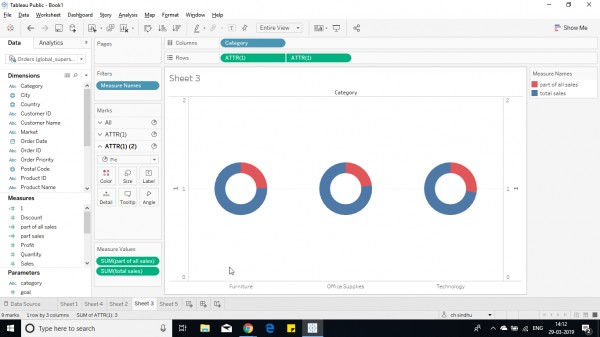
9.Now remove all headers,format and add required labels.
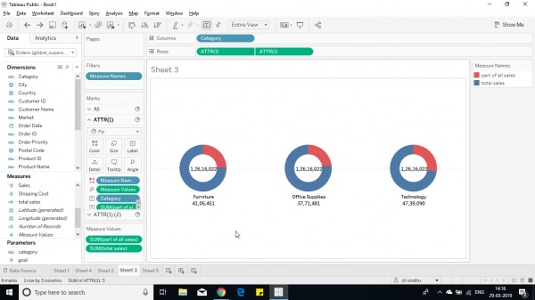
10. A donut chart with each partition is created.

Hope this helps you. 

answered Mar 29, 2019 by Cherukuri
• 33,030 points

Related Questions In Tableau

0 votes
1 answer
0 votes
1 answer

Creating a dual axis chart with same measure in Tableau

Yes, this is possible. Drop the measure in ...READ MORE

answered May 29, 2018 in Tableau by Atul
• 10,240 points
8,754 views
0 votes
1 answer

Tableau chart with mixed colors

It is as simple as dragging the ...READ MORE

answered Jun 28, 2018 in Tableau by ffdfd
• 5,550 points
1,959 views
0 votes
0 answers

Half donut chart in tableau

How to make a half donut chart? READ MORE

May 10, 2019 in Tableau by Anitha
2,053 views
0 votes
1 answer

How to make donut chart?

Hi Sindhu, Follow these steps to create a ...READ MORE

answered Mar 29, 2019 in Tableau by Cherukuri
• 33,030 points
1,744 views
0 votes
1 answer

one partition vs all - donut chart

Hi Anshuli, Follow below steps: 1. Create a parameter ...READ MORE

answered Apr 23, 2019 in Tableau by Cherukuri
• 33,030 points
681 views
0 votes
1 answer

Donut chart - Tooltip/display message

Hi Preethi,  You can edit the heading for tooltips ...READ MORE

answered May 7, 2019 in Tableau by Cherukuri
• 33,030 points
1,017 views
0 votes
0 answers

Stacked donut chart

How to make a stacked donut chart? READ MORE

May 10, 2019 in Tableau by Anitha
701 views
0 votes
1 answer

Tableau- Pie Chart with Multiple Measure Values

Hi Nithin, Pie chart is used to show ...READ MORE

answered Mar 11, 2019 in Tableau by Cherukuri
• 33,030 points
21,210 views
0 votes
2 answers

How can I add text in the centre of a Donut Chart ?

Hi, You can read this for creating a donut ...READ MORE

answered Apr 4, 2019 in Tableau by Cherukuri
• 33,030 points
12,124 views
webinar REGISTER FOR FREE WEBINAR X
REGISTER NOW
webinar_success Thank you for registering Join Edureka Meetup community for 100+ Free Webinars each month JOIN MEETUP GROUP