


Business Intelligence Internship Program with ...
- 3k Enrolled Learners
- Weekend/Weekday
- Live Class
(5)


 Copy Link!
Great dashboards are more than just data visualization tools; they also tell stories. However, what if you could provide an even better insight without using an unappealing visualization? Enter Power BI ToolTip. Indeed, it is the crown jewel, and it has made the majority of the reports interactive.
With a simple hover, ToolTips provide additional data, mini charts, KPIs, dynamic insights, and other features without leaving your main report. Whether you’re creating financial reports or dashboards to track and analyze sales, ToolTips adds color and depth to your data storytelling.
Are you prepared to make your Power BI report smarter and more engaging? So, let’s see how ToolTips will improve your data experience!
In Power BI, a ToolTip is a tiny pop-up window that shows up when a user hovers over a data point in a visualization. Without having to visit separate report pages, it gives users more information about the chosen data, enabling them to recognize trends and patterns.
You can alter ToolTips beyond the default view in Power BI by:
Make specific pages for more in-depth insights with Report Page ToolTips.
Power BI ToolTips use these features to turn basic data points into dynamic, rich experiences.
You now understand what a Power BI ToolTip is. Now, let’s discuss why the Power BI ToolTip is used.
By adding extra insights without overcrowding the main report, Power BI ToolTips improve data exploration and user experience. By enabling users to hover over data points and view important details instantly, they enhance their comprehension of relationships, comparisons, and trends.
Important Justifications for Using Power BI ToolTips:
Next, we all see Power BI’s Types of ToolTips.
Three Types of ToolTips Provided by Power BI to Support the Interactivity of Reports:
The basic ToolTip that a user sees by default whenever he moves his mouse over an image shows the data values associated with it. It will give you that simple overview without any customization.
Custom ToolTips would allow the report designer to associate fields, conditional formatting, calculated measures, etc., making the popup more logical.
Such ToolTips would use a separate Power BI report page designed as a tooltip page. This would thus provide much more advanced visuals, dynamic insight, and customized layouts along with the general purpose of the standard tooltip.
Now that you are aware of the different kinds of Power BI tooltips, let’s look at how to make a custom one.
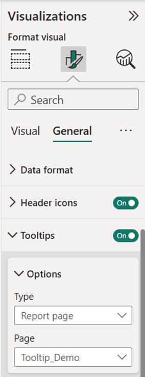
To create a Report Page ToolTip in Power BI, follow these steps:
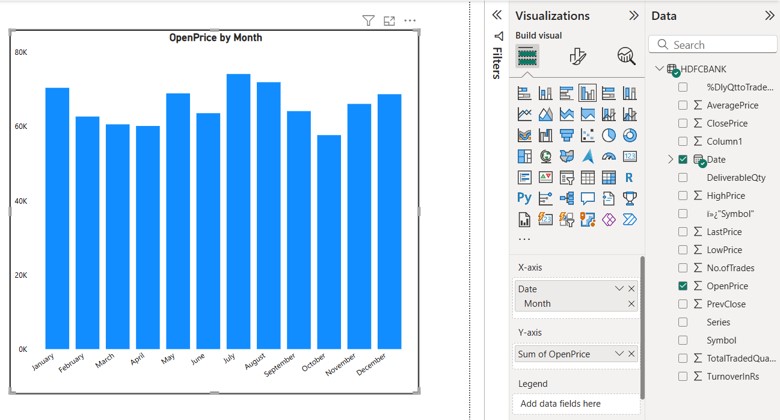
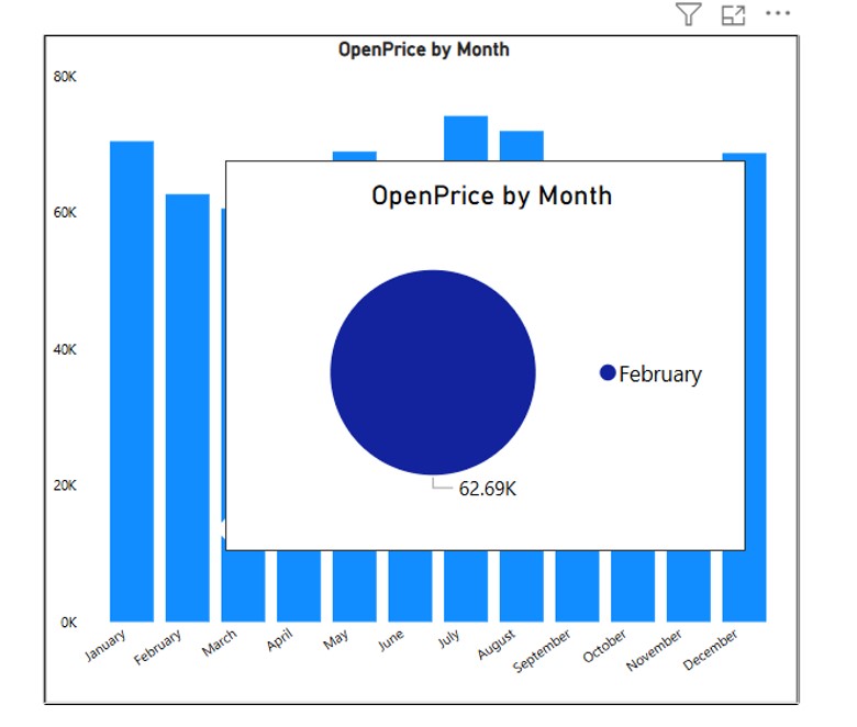
I’ve created a graph on the report page, with the X-axis representing the date values of each month and the Y-axis showing the sum of the open price. The graph has been successfully created.
To enhance data exploration and user experience, we will now develop a tooltip for this graph that offers more information without overcrowding the main report.
On the Tooltip_Demo page, create a chart to depict the ToolTip and fill it in with pertinent data.
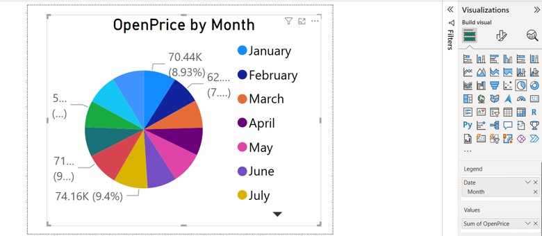
Now, the Open Price by Month chart will display each month’s data in the form of a Pie Chart, providing a clear representation of the data for each month. The information will be well-explained based on monthly trends.
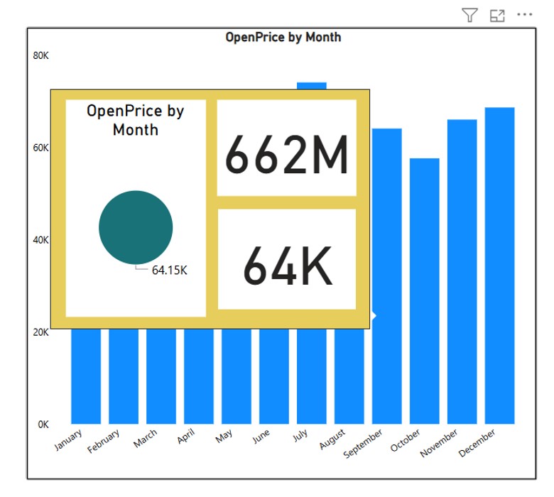
You can also customize the background color of the Tooltip chart to enhance its visibility.


I hope you now know how to make a tooltip in Power BI Desktop, as well as how to add a background and multiple charts. Next, we’ll go over The Best Ways to Use Power BI ToolTips.
Power BI Full Course – Learn Power BI in 4 Hours | Power BI Tutorial for Beginners | Edureka
This Edureka video on the “Power BI Full Course” will help you understand and learn Power BI
Conclusion
One useful feature that enhances data exploration and user experience is Power BI ToolTips. Report designers can add more fields, images, and interactive components to ToolTips to give deeper insights without overcrowding dashboards.
This blog covered Power BI ToolTips, their role in enhancing data exploration, and how to create custom ToolTips with multiple charts. It also highlighted the differences between default and Report Page ToolTips. While ToolTips improve interactivity and insights, optimizing them is essential for clarity and performance in Power BI reports.
If you are interested in advancing your skills and your career prospects in Power BI, then you should explore the latest courses and Training programs. We recommend you take up the Power BI Certification Training offered by Edureka. Edureka’s Power BI certification course by PwC offers dual certification in business intelligence. The training is live instructor-led and provides hands-on experience in real-time projects. It prepares you for the official PL-300 exam and offers simulated real-world scenarios.


 Thank you for registering Join Edureka Meetup community for 100+ Free Webinars each month JOIN MEETUP GROUP


