Donut chart - R

0 votes
Is it possible to create a donut chart in R? Can someone explain?
Aug 16, 2019 in Data Analytics by kruthi
1,830 views

1 answer to this question.

0 votes

@Kruthi,

Refer to this blog on how to create a pie chart, then follow the below steps.

https://www.edureka.co/community/54913/pie-chart-using-ggplot-r?show=54913#q54913

Convert the above used ggplot statement as below - 

>ggplot(mpg1,aes(x=3,y=displ,fill=as.factor(cyl)))+geom_bar(stat="identity")+coord_polar("y",start=0)+theme_void()+xlim(1,4)
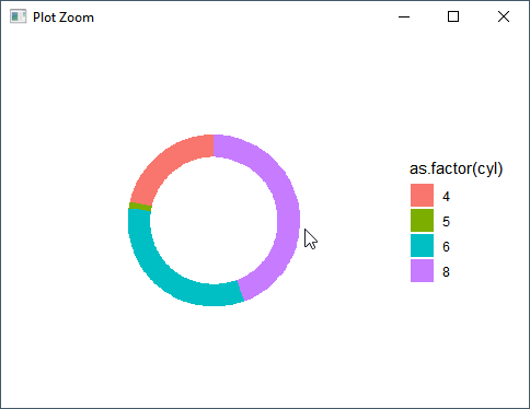
In the above code xlim() zooms into a specified area and x=3 here is the row that is focused on.

See the below code and picture for better clarity.

>ggplot(mpg1,aes(x=4,y=displ,fill=as.factor(cyl)))+geom_bar(stat="identity")+coord_polar("y",start=0)+xlim(1,7)
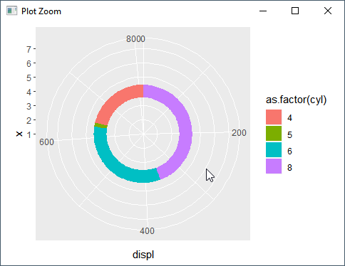
Hope it helps you.

answered Oct 28, 2019 by Cherukuri
• 33,030 points

Related Questions In Data Analytics

+2 votes
1 answer

R programming: Drawing an xbar and R chart using qcc package

Try this: #x-Bar library(qcc) x=c(1080͵ 1390͵ 1460͵ ...READ MORE

answered Jan 25, 2019 in Data Analytics by Tyrion anex
• 8,700 points
1,561 views
0 votes
0 answers
0 votes
0 answers

Chart/plot to show 3 dimensions in a chart - R

Hi, I want to show chart with ...READ MORE

Jul 12, 2019 in Data Analytics by kalyan
543 views
0 votes
1 answer

Create a dual axis column/bar chart using ggplot in R

Add position = "stack" in geom_bar() function ...READ MORE

answered Nov 4, 2019 in Data Analytics by sindhu
4,633 views
0 votes
1 answer

By using dpylr package sum of multiple columns

Basically here we are making an equation ...READ MORE

answered Apr 5, 2018 in Data Analytics by DeepCoder786
• 1,720 points
2,250 views
0 votes
1 answer

How to convert a text mining termDocumentMatrix into excel or csv in R?

By assuming that all the values are ...READ MORE

answered Apr 5, 2018 in Data Analytics by DeepCoder786
• 1,720 points
1,920 views
0 votes
1 answer

In a dpylr pipline how to use sample and seq?

For avoiding rowwise(), I prefer to use ...READ MORE

answered Apr 6, 2018 in Data Analytics by DeepCoder786
• 1,720 points

edited Jun 9, 2020 by Gitika 1,182 views
0 votes
1 answer

How to create a list of Data frames?

Basically all we have to do is ...READ MORE

answered Apr 9, 2018 in Data Analytics by DeepCoder786
• 1,720 points
1,339 views
0 votes
1 answer

Aggregation of fields vs field value line chart in R

Of course, it can be done. Let ...READ MORE

answered Nov 3, 2019 in Data Analytics by Cherukuri
• 33,030 points
634 views
0 votes
1 answer

R chart using plotly

Plot_ly example library(plotly) today <- Sys.Date() tm <- ...READ MORE

answered Nov 4, 2019 in Data Analytics by Cherukuri
• 33,030 points
987 views
webinar REGISTER FOR FREE WEBINAR X
REGISTER NOW
webinar_success Thank you for registering Join Edureka Meetup community for 100+ Free Webinars each month JOIN MEETUP GROUP