Follow the below steps:
1. Run Power BI and load the data source.
2. If Python Script does not exist, then to setup python script in Power BI visit below link,
https://www.edureka.co/community/49714/setup-python-with-power-bi
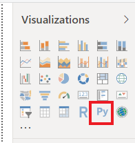
3. Once Python is setup. Click on Python Script on the desktop window.

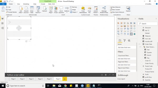
4. Python script visual is seen on the screen.

5. Go to Python script and select the fields that you want to use in visual.
6. Now install matplotlib in python using pip.
7. Then write code as below - to create a bar chart.
import matplotlib.pyplot as plt

plt.bar(dataset.Market,dataset.Sales)

plt.xlabel("Sales")

plt.ylabel("Profit")

plt.show()
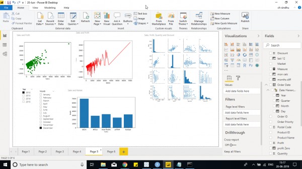
To create a Scatter chart using Python - use below code with different fields as required.
import matplotlib.pyplot as plt

plt.plot(dataset.Sales,dataset.Profit,'go')

plt.xlabel("Sales")

plt.ylabel("Profit")

plt.show()
Another example of pair plot that is present on the top right side of the screen with multiple graphs is used to show the correlation of different fields.
import matplotlib.pyplot as plt

import seaborn as ssn

ssn.pairplot(dataset)

plt.show()
In the above 2 Python scripts, within ' ' indicates the type of plot and color such as g,r indicates green and red color for the graph and o,- indicates scatter plot or dashed line chart and combining both you would get a dual axis chart.
So you can play around with plot function and different plots available using format.
Different plot libraries are available in python to use other than mathplotlib. One such package is seaborn
I have created few charts in Power BI using Python, You can check out them below -

If you are interested in learning Power BI, then check out Power BI Online Training now!
 REGISTER FOR FREE WEBINAR
X
 Thank you for registering
Join Edureka Meetup community for 100+ Free Webinars each month
JOIN MEETUP GROUP