Advanced Power BI Certification Course with G ...
- 12k Enrolled Learners
- Weekend
- Live Class
When we talk about data visualization tools, two names definitely pops up in our mind – Tableau and QlikView. But it has always been a dilemma which tool to choose out of the two. There has always been a silent battle between the two tools – Tableau vs QlikView. Both of these tools are in Leaders quadrant of Gartner’s magic quadrant among BI tools. Take a look at the diagram below:
In order to decide which tool to use for Data Visualization, it is very important for you to understand about both of these tools. It’s wrong to just listen to the word of mouth and just go with the majority. You can always be the better judge.
So, I will tell you all you need to know about Tableau and QlikView and you will tell me in the comment section below which tool do you think is the best and why. Fair enough? ;)
And since we are talking about data visualization tools, let’s move ahead in this Tableau vs QlikView blog and understand what is data visualization first. Then only we can observe whether these tools fit the requirements or not.
Big Data is booming!
In order for Big Data to have an enormous impact on the way information is disseminated and analyzed, data visualization plays a tremendous role. There are many organizations that find it real challenging to interpret data, and this is exactly where data visualization comes to the rescue. It is a generic term that describes an organization’s efforts to help them comprehend the significance of data by converting it into visual content. There are many important elements, including patterns and trends that often go unobserved in text-based data, but can be easily noticed with data visualization. It also helps digest information in the form of heat maps and rich graphical representations.
A picture conveys the meaning better than text. Similarly, data visualization provides access to rich visual elements that enhance the quality and ease of comprehension of the information being conveyed. Another vital benefit of data visualization is the stage at which it is employed. At this stage, the analyzed data passes on from the data scientists to business stakeholders. The latter group needs to be presented with the insights in a meaningful way so that they can understand the impact and influence of the insights. This is where data visualization comes in handy.
Therefore, it is very important to understand which is the best tool that will provide us with better solutions.
Let’s move ahead in this Tableau vs QlikView blog and compare these tools with the following parameters:
 1. Ease of Use
QlikView : It is easy to use and explore the hidden trends. To search, just type any word in any order into search box for instant and associative results and it will show connections and relationships across your data. It is difficult for user to design their own views due to menu driven properties.
Tableau: Its interface is simple, not filled with too many features at one page and has a drag and drop interface. It does not provide feature to search content across all your data. User can easily create their own views using various objects and it is easy because of well designed GUI interface.

QlikView: It has actively engaged community and resources to help you learn this software in the best possible manner.
Tableau: It also has actively engaged community and resources. It is a simple drag & drop application which makes it very easy to learn.

QlikView: Its personal edition is free with limitation of document sharing. Each named user license is $1,350 and $15,000 for a concurrent user. Server license is $35,000/server. Additional $21,000/server for PDF distribution service; $22,500 for SAP NetWeaver connector.
May require RAM upgrades if large numbers of concurrent users.
Tableau: Free Desktop version called “Public” that makes data is available for all to download. Private versions come with fixed fee $999 or $1,999 depending on data access. Tableau Server – anecdotal evidence says $1000/server user, with minimum of 10 users plus maintenance.
 4. Connectivity with Other tools/ Language or Database
QlikView: It integrates with a very broad range of data sources like Amazon Vectorwise, EC2, and Redshift, Cloudera Hadoop and Impala, CSV, DatStax, Epicor Scala, EMC Green Plum, Hortonworks Hadoop, HP Vertica, IBM DB2, IBM Netezza, Infor Lawson, Informatica Powercenter, MicroStrategy, MS SQL Server, My SQL, ODBC, Par Accel, Sage 500, Salesforce, SAP, SAP Hana, Teradata, and many more. It can connect with R using API integration. It can connect with Big data.
Tableau: It can integrate with a broader range of data sources including spreadsheets, CSV, SQL databases, Salesforce, Cloudera Hadoop, Firebird, Google Analytics, Google BigQuery, Hortonworks Hadoop, HP Vertica, MS SQL Server, MySQL, OData, Oracle, Pivotal Greenplum, PostgreSQL, Salesforce, Teradata, and Windows Azure Marketplace. It can connect with R that powers the analytical capabilities of the tool. It can also connect with Big data sources.
 5. Deployment Process & System Requirement
QlikView: QlikView has its own data warehouse and addition of scripting feature adds more value to it. We can use multilevel layers in QlikView deployment. QlikView is easily deploy-able and configurable, and starts producing stunning reports within minutes of installation. This product does not use cubes; hence loads all the tables and charts in memory to enable interactive queries and creation of reports—a technology not found in other products. It can be developed on both 32 and 64 bit. Its associative technology makes data modeling easier.
Tableau: It does not have its own data warehouse. It can not create layers while connecting with data set. It is more easier to deploy because it requires more structured data.

QlikView: Associative technology makes it more powerful and it helps to read association between variables easily. This feature sometimes help businesses to understand hidden relation between data points.
Tableau: Story telling feature helps you to create presentation, using your available data points.
 7. Visualization Objects
QlikView: It has good options available to visualize information. It is loaded with various objects. We can play with properties of these objects easily to customize it. We can also create custom charts like waterfall, boxplot, geo-spatial charts by customizing properties. While inserting object, it has layout and formatting options similar to theme of the document. Here, we need to work on formatting options to make it more visually appealing.
Tableau: It has good visualization objects with better formatting options. It has very good visualization for geo-spatial visualizations. It has numerous options of visualizing your data. The visualizations are always in the best quality.
 8. Mobility
QlikView: QlikView is not dependent on a device, we can easily access it from anywhere. Decision making becomes much faster compared to traditional methods.
Tableau: It is also available on all devices and can be accessed over internet. You can use Tableau on your laptop, tablet or phone.
 9. Security
QlikView: It has various security options like security for Script, Document, Section Access and user authentication. Direct access to the QlikView Document using QlikView Desktop is always governed by Windows NTFS File Security. Access to the web-based QlikView Enterprise Management Console is restricted to Windows Users who are a member of a particular local Windows Group.
Tableau: Tableau has good security feature and it is highly handled by Tableau server. Tableau is a modern enterprise analytics platform that enables self-service analytics at scale through governance. Security is the first and most critical part of a data and content governance strategy. Tableau Server provides the comprehensive features and deep integration to address all aspects of enterprise security. Tableau helps organizations promote trusted data sources for all users, so the right data is used to make the right decisions quickly.

You may have heard Tableau offers better scalability than QlikView, or that QlikView can scale faster than Tableau. The truth is, both vendors can handle a huge amount of data. In fact, the majority of organizations are not producing that much of data which either solution can’t handle.

Now, let us take a look at the architecture of both the tools. This will help you identify the flexibility of both the tools.
Tableau vs QlikView: Tableau Architecture
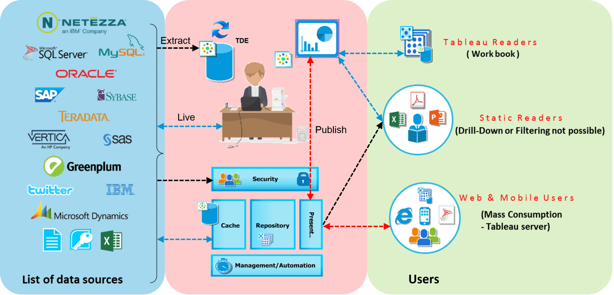
Tableau Architecture is mostly focused on three stages : Integrating, Analyzing & Visualizing.
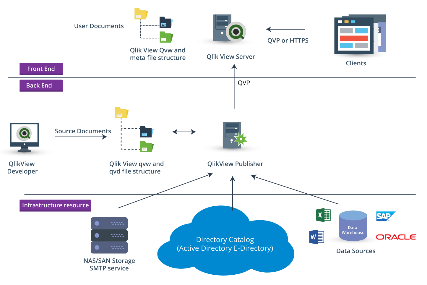
QlikView Architecture is based on three parts: Front End, Back End and Resources.
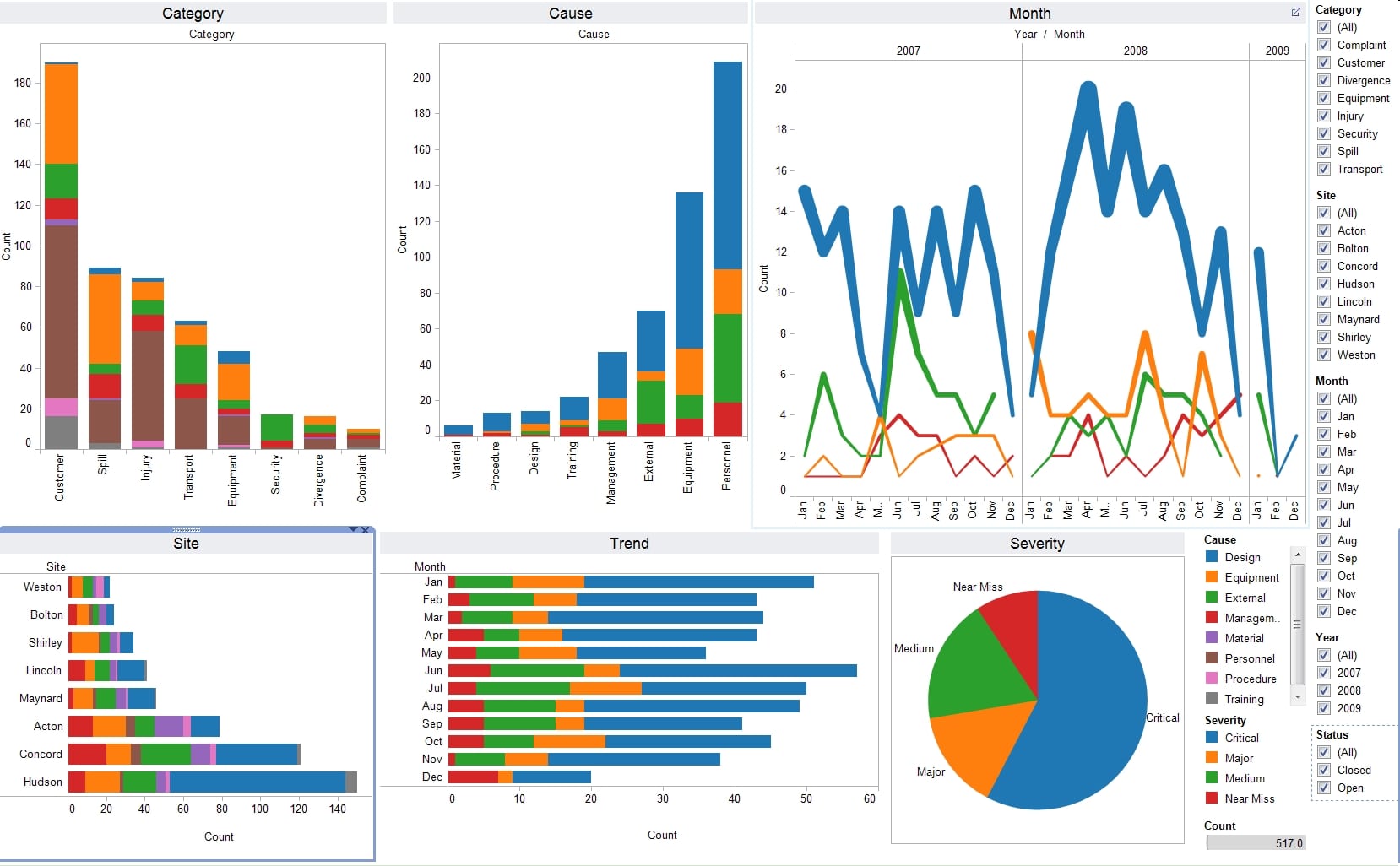
Let’s see how does each of these tool make visualizations:
Tableau:
QlikView:
This is how a QlikView Dashboard looks like:
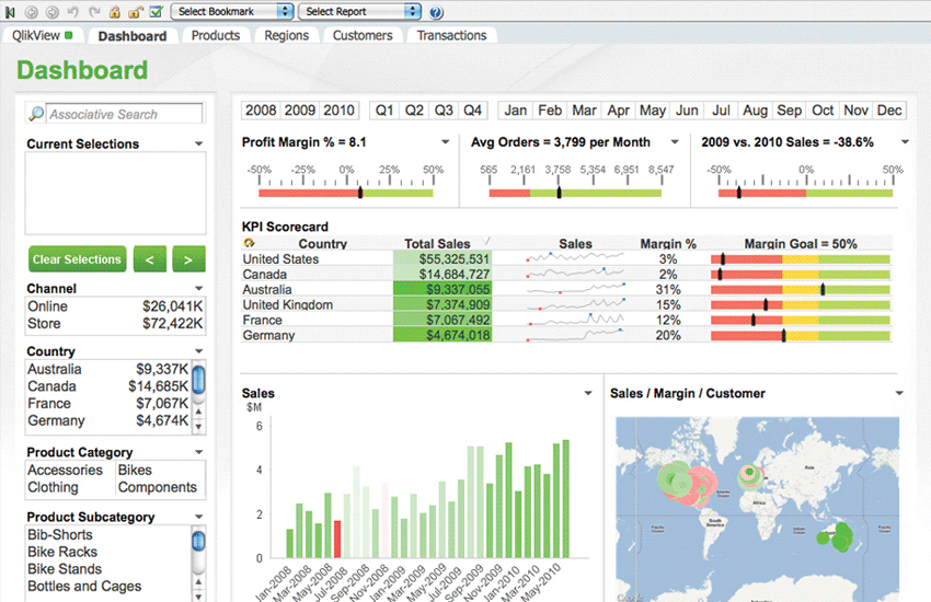
The most important thing you should know that QlikView is used for data discovery rather than just visualizing the data. On the contrary, Tableau is a very powerful tool for visualization only. Now, I have mentioned the parameters and compared both the tools. To be very clear, you can use Tableau & QlikView for different purposes.
This brings us to the end of Tableau vs QlikView blog. I am sure with the above comparison you will be able to identify which tool suits you the best for your needs. I will be coming up with blogs on QlikView very soon and if you want to learn about Tableau, you can check out this blog.
If you wish to master Tableau or QlikView, Edureka has a curated course on Tableau Certification Training or QlikView Training & Certification which covers various concepts of data visualization in depth. It comes with 24*7 support to guide you throughout your learning period. New batches are starting soon.
Got a question for us? Please mention it in the comments section and we will get back to you at the earliest.
 Thank you for registering Join Edureka Meetup community for 100+ Free Webinars each month JOIN MEETUP GROUP
edureka.co
I am using Tableau and AIS but I found AIS to be more powerful than any other. It is best in terms of reporting, self service and dashboarding.
I have a dashboard in QA which I downloaded as twbx file and saved locally. When I create a local copy of the Data Source I get completely different numbers. Why?