


Every Organization Needs a visual cue that communicates the amount of progress it has made towards a target. The Power BI KPI demonstrates how effectively a company is achieving its key business objectives.
This blog, specifically, will help you with all you need to know to use Power BI KPI to its complete potential.
What is KPI?
Organizations use KPIs (or Key Performance Indicators) at multiple levels to evaluate their success at reaching targets. High-level KPIs may focus on the overall performance of the enterprise, while low-level KPIs may focus on processes or employees in departments such as sales, marketing, or production.


When to use a Power BI KPI?
KPIs mainly answer 2 questions:
- What am I ahead or behind on?
- How far ahead or behind am I?
A KPI is based on a specific measure and is designed to help you evaluate the current value and status of a metric against a defined target.

In this video on *KPI Visual in Power BI * , we will explore the fundamentals of Microsoft Power BI’s Key Performance Indicators (KPIs).
Requirements for Power BI KPI visualizations
A Power BI KPI visual requires a base measure that evaluates to a value and a target measure, and a threshold or goal.
Currently, a KPI dataset needs to contain goal values for a KPI. If your dataset doesn’t contain one, don’t worry. You can create goals by adding them to your data model.


Power BI KPI Visualizations on the Power BI Desktop
Pick some KPI-appropriate data. As you can see, the one I’ve chosen here has got an actual sales column and a target sales column. The months are numbered according to their usual order as well as fiscal order. 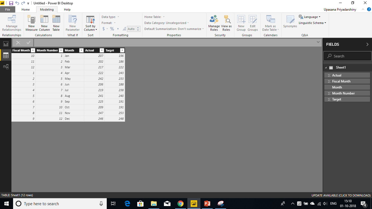

We’ll create a Power BI KPI visual that measures the progress we’ve made towards a sales goal.
- Open the report in Report View.
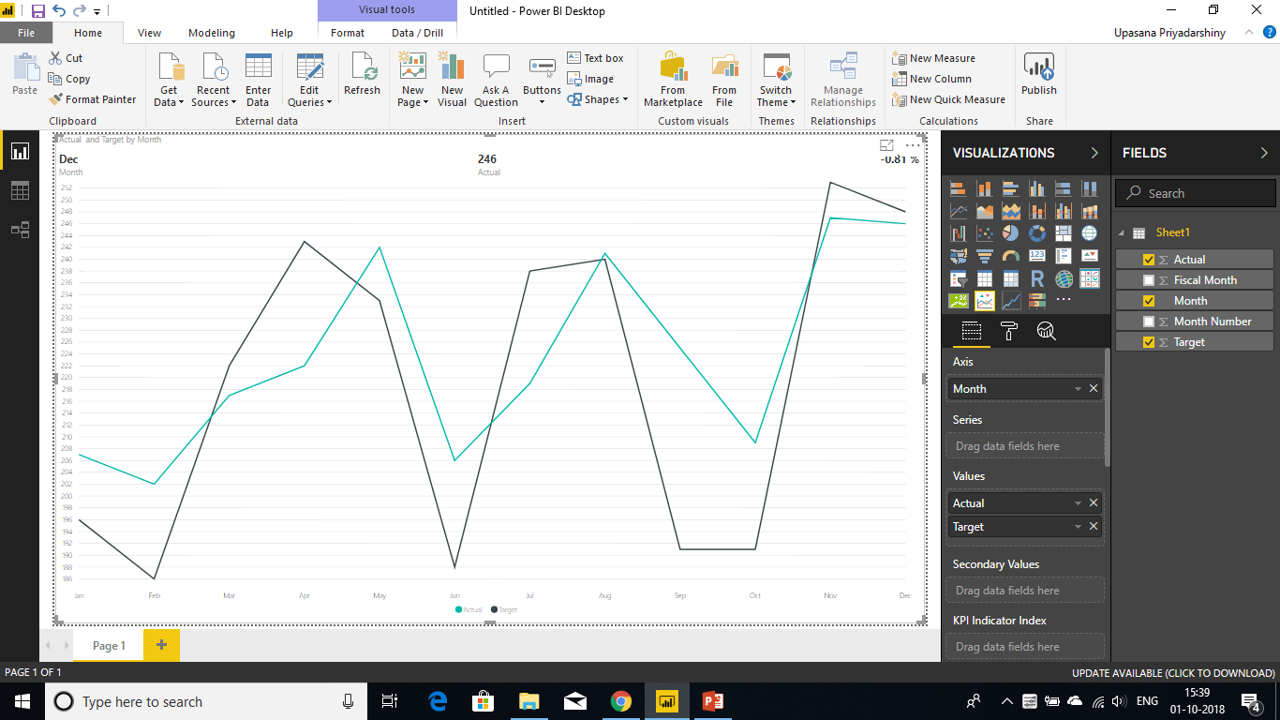
- From the Fields pane, select Actual Sales and drop it on the screen. This will be the Indicator.
- Do the same to add the time period, i.e, Month. This will be representing the Trend.
You can now go to the Modelling option on the top ribbon and use the Sort option to sort by the order in which you need the months to be.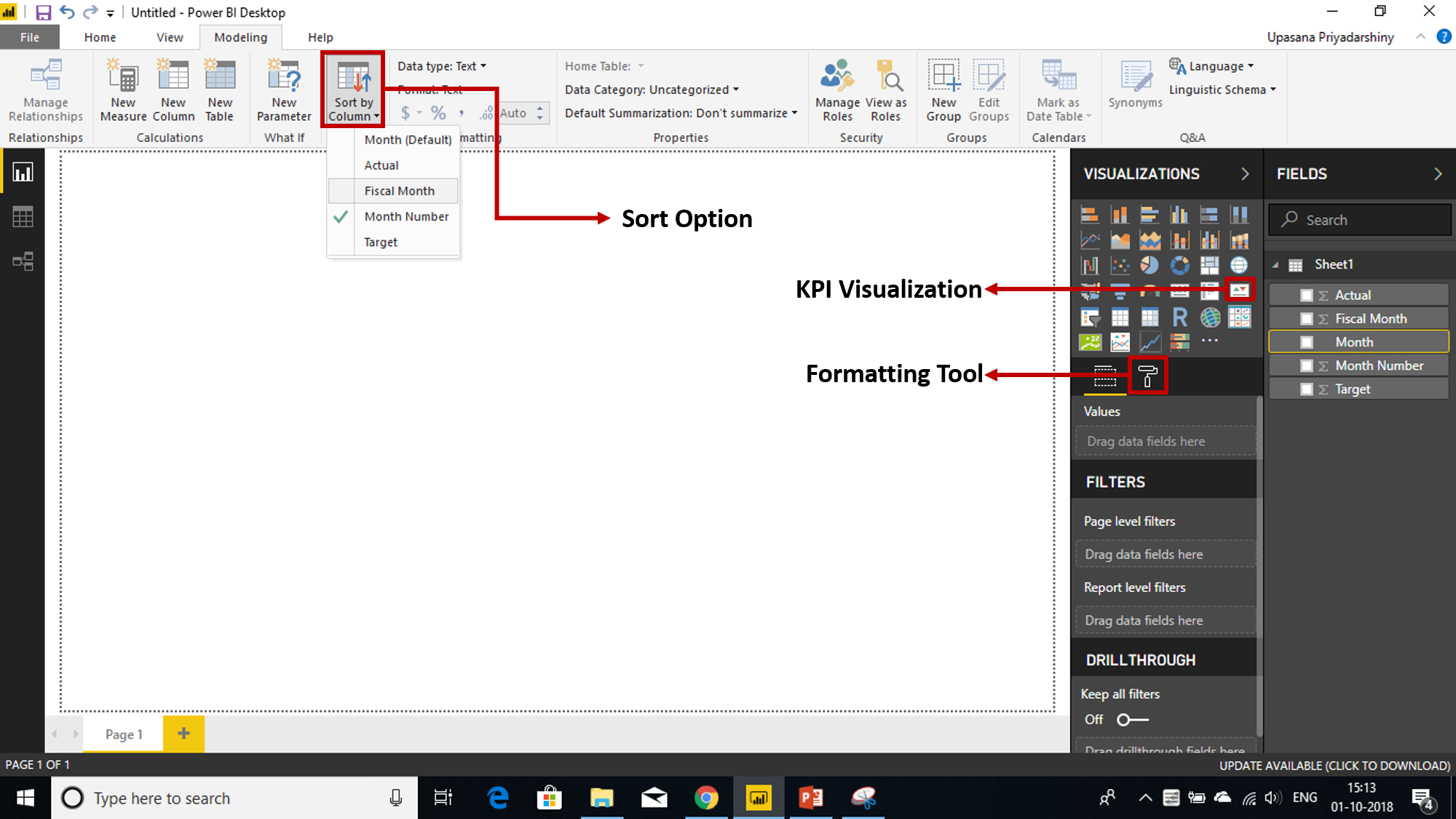
- Convert the visual to a KPI by selecting the KPI icon from the Visualization pane.
- Now you can add the Target column to the Target Goals field.
Optionally, format the KPI by selecting the paint roller icon to open the Formatting pane.
- Indicator: controls the indicator’s display units and decimal places.
- Trend axis: when set to On, the trend axis is displayed as the background of the Power BI KPI visual.
- Goals: when set to On, the visual displays the goal and the distance from the goal as a percentage.
- Color coding > Direction: some KPIs are considered better for higher values and some are considered better for lower values. For example, Return on Investment (RoI) versus wait time. Typically, a higher value of RoI is better versus a higher value of wait time. You can select the higher value and, optionally, change the color settings of the same.
Considerations & Troubleshooting
If your KPI doesn’t look like the given image, you might want to consider sorting by fiscal month or month number before you turn it into a KPI. In a few older versions of Power BI, KPIs don’t have a sort option, you’ll need to sort by fiscal month before you convert your visualization to a KPI.
Transform data into insights and advance your career with our comprehensive Business Analyst Course.
Now that you know how this tool basically works, you can do some really smart things with it. Like you can create custom visuals in Power BI.
Power BI Full Course – Learn Power BI in 4 Hours | Power BI Tutorial for Beginners | Edureka
You may go through this Microsoft Power BI recording where our expert has explained the topics in a detailed manner with examples that will help you to understand the concepts better.
Elevate your data analysis skills to expert levels with our in-depth Power BI Course. Gain the advanced expertise to analyze, visualize, and report data like a pro.
Custom Visuals in KPI
You can do a bunch of other interesting things with Power BI KPI Visual. For example, you can use many variations of the traditional KPI. For that, all you must do is, go to From Marketplace and in the search-tab look for the custom visuals that you like. Or you can even go to visuals.powerbi.com and do the same. It will appear on your visualizations bar, next to other visualizations. 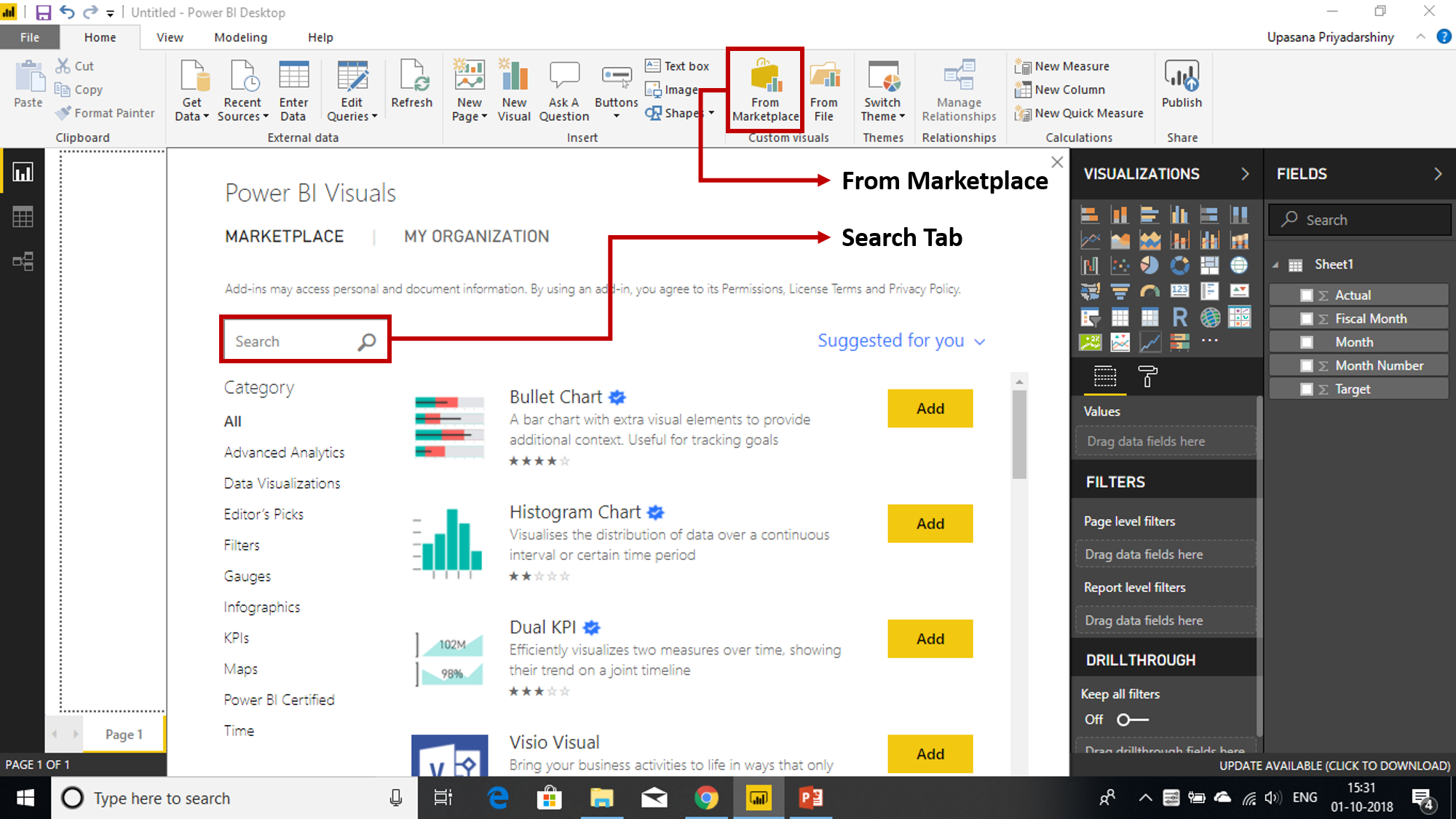
So, here are 4 custom visuals you didn’t know you needed.
- Power KPI: Along with a multi-line chart, the Power KPI also adds labels for the current date, value, and variances.
- KPI Indicator: Unlike the traditional KPI, the KPI Indicator presents the status as a color indication, comparing the actual and target values. The deviation is presented as a distance in percent of actual from the target. The trend could be presented as a line or a bar chart. It is up to the user to decide the granularity of the data displayed.

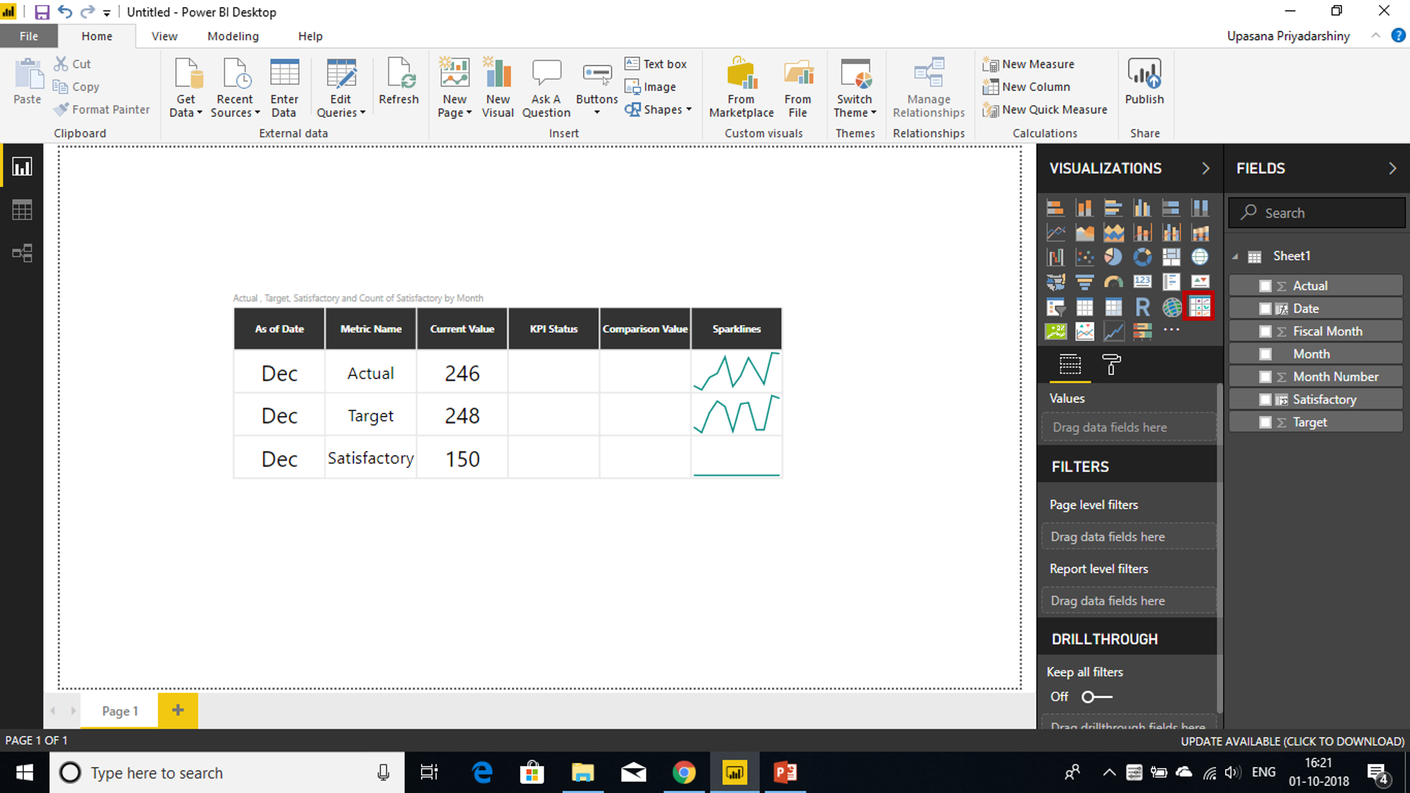
- Power KPI Matrix: Power KPI Matrix enables balanced scorecards in Power BI and displays an unlimited number of metrics and KPIs in a single, customized list.
- Bullet Chart: The bullet chart serves as a replacement for dashboard gauges and meters. Bullet charts were developed to overcome the fundamental issues of gauges and meters. The bullet chart features a single, primary measure, compares that measure to one or more other measures to enrich its meaning, and displays it in the context of qualitative ranges of performance, such as poor, satisfactory, and good.

Now that you’ve learned all about the Power BI KPI, go on and make the most of it. Create live and intuitive visualization reports with Power BI KPI. Willing to learn more about Power BI Concerts, then you can check out our Power BI Training in Hyderabad or Power BI Training in Delhi and become a successful Power BI Developer.
Dive into the world of data modeling and analysis with our in-depth Power BI DAX blog.
Also, If you wish to build a career in business intelligence, our Business Intelligence Training Course will help you mine that data and enhance the decision-making processes throughout your organization.